
Limbix VR Kit
UX research, Interaction Design, UI Design
Challenge
Limbix is an early-stage, Sequoia-backed startup that creates mental health treatments using virtual reality. Therapists use Limbix to help patients overcome fears and anxieties in VR with a technique called "exposure therapy". For example, a patient with a fear of flying can practice being on a plane in virtual reality.
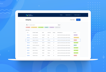
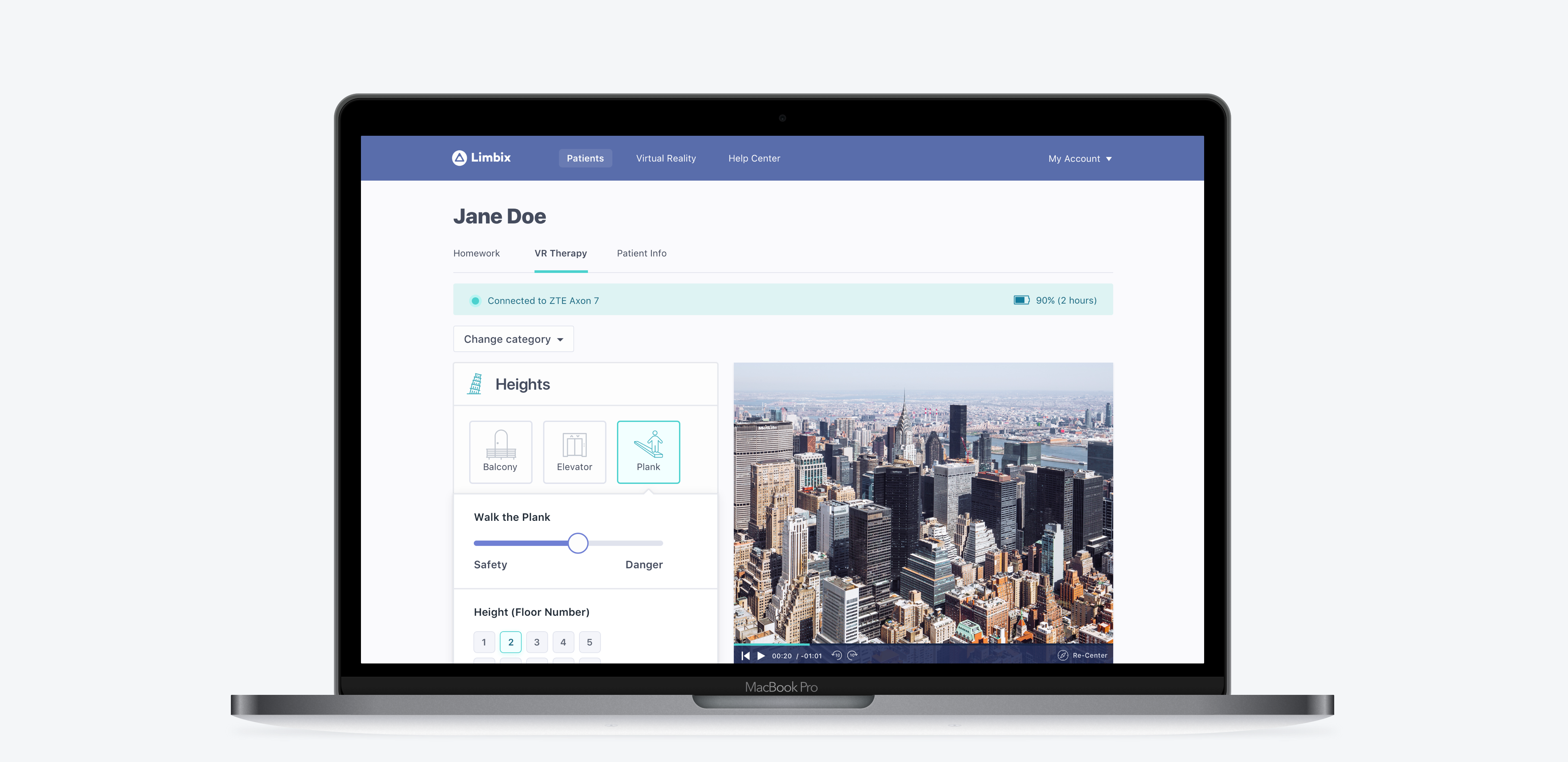
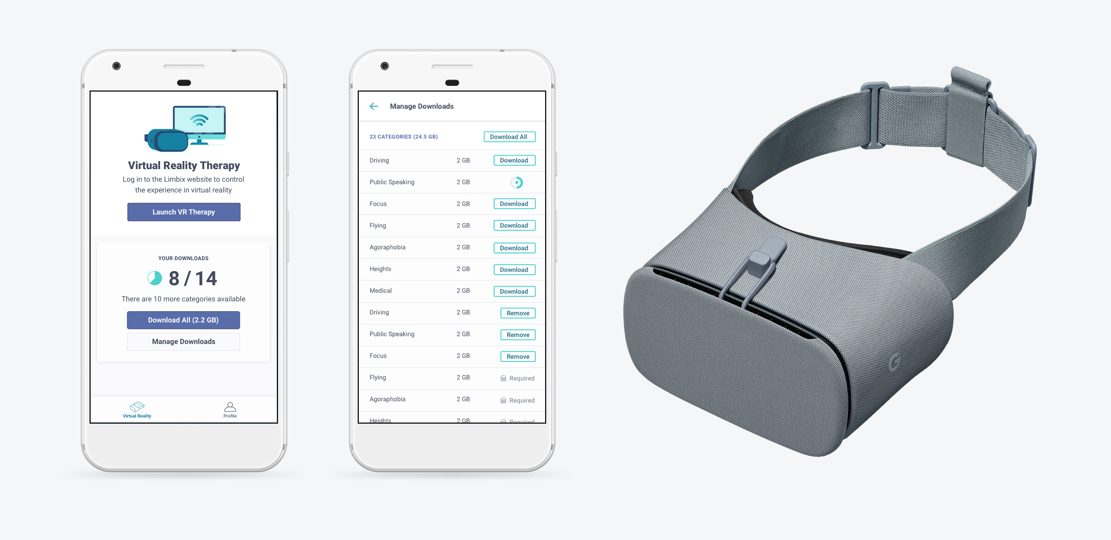
I joined Limbix as the first designer and we launched a product that included an Android app for content management and launching VR, a web app for therapists to monitor and control their patients' experiences, and of course a Daydream VR app. Here's what the original product looked like (designed during my first year at Limbix):


While the first release of our product received positive user feedback as well as press from The New York Times and Vice, we encountered some issues as we began to grow.
We started creating content for a broader range of treatments beyond exposure therapy, and made sales to larger enterprise customers. Both changes required new workflows. Additionally, VR tech changes quickly and the release of a few lower-cost, higher-quality standalone headsets gave us new options to consider. These factors required us to step back and holistically reconsider the design of our product.
Process
I proposed that our team launch the redesign with a week-long design sprint. Our goal was to better understand and test the primary workflow for our new VR content. The new VR programs were self-guided and didn't require constant therapist attention, so we wanted the product to be more hands-off in order to save clinics time and money.
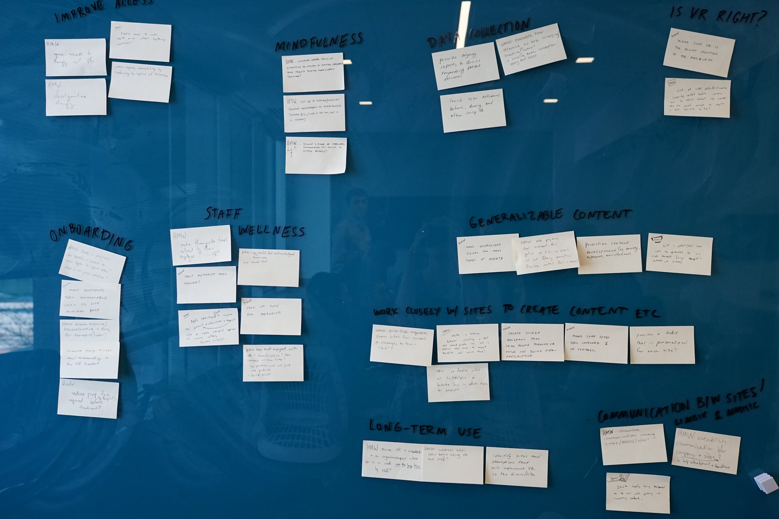
I designed and led the sprint. We flew out to Denver and I led a workshop with around twenty people (our team of eight and our partner, the National Mental Health Innovation Center). We listed long term goals and sprint questions, drew out a rough user journey map, heard from a variety of mental health experts, and concluded with a “How Might We” brainstorm around the idea of using VR to save therapists time (which could decrease burnout and save money for clinics). We also spent a day-and-a-half touring a variety of clinics and met with business stakeholders and clinicians at each site.

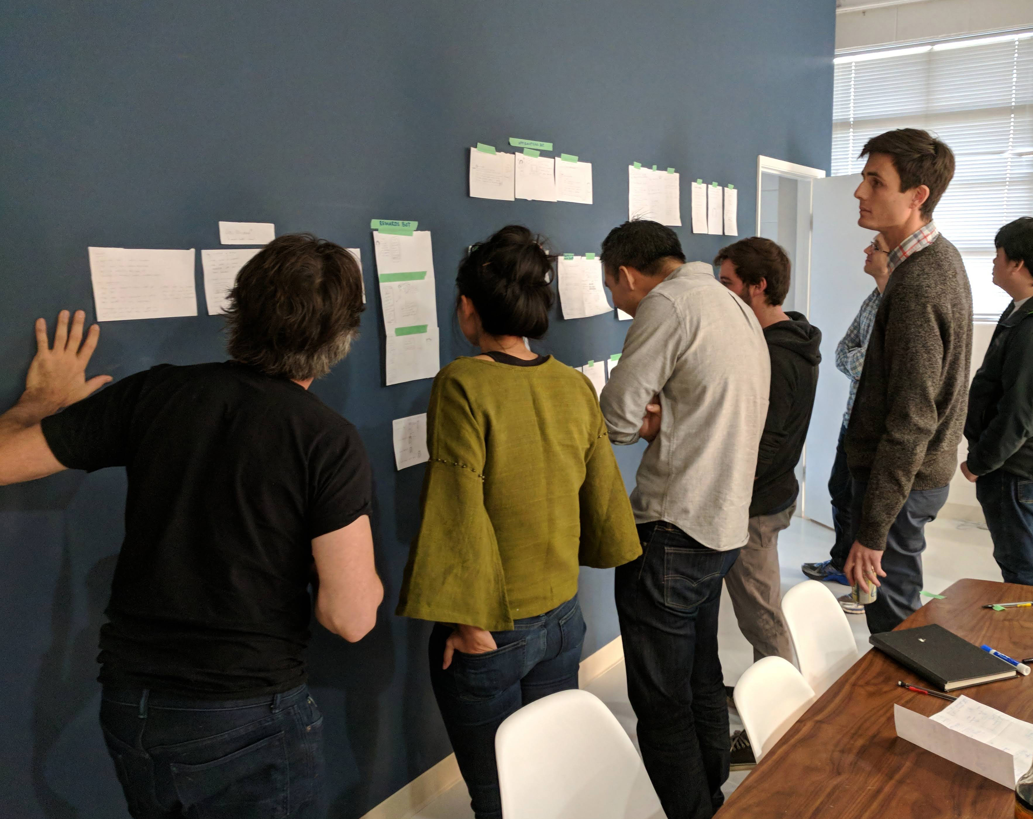
When we returned to Palo Alto, our team sketched out a range of solutions using guided sketching activities like Crazy Eights and three-panel solution sketches. We then used dot voting to choose a solution, which I prototyped and tested. After testing, I iterated and tested the design another two times before sending to our dev team.

Outcome
The result of the sprint and weeks of iteration after was a completely redesigned version of Limbix: The Limbix VR Kit. The product was designed for our primary workflow where a lower-licensure staff member launches a patient into a VR program at the beginning of the patient’s therapy session (before the therapist arrives). It saves clinics money by reducing the length of time spent with a therapist, while still providing effective, evidence-based treatments created with our academic partners.
Below are the three major improvements to the product.


1. Better form factor for therapists
We heard from therapists that it felt intrusive to use a computer in a therapy session, so we turned our web app into an Android tablet app run in kiosk mode. Since clinic WiFi was often unreliable, we also switched to communicate using Bluetooth rather than WiFi.
This change also better supported our new workflow where a larger variety of staff are controlling the VR experience and may not stay with the patient the whole time. We also wanted to make sure the VR headset and tablet would always be together and charged, so we outsourced design for a portable charging station.
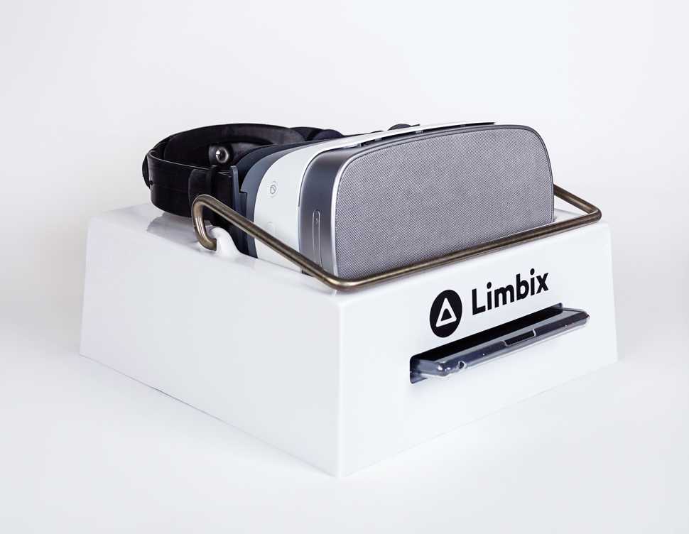

Limbix VR Kit: VR headset and tablet in portable charging station
2. Faster & Easier to Launch
We switched from our Daydream mobile VR to a standalone headset to reduce friction. In order to use Limbix before our redesign, the therapist had to unlock their phone, find the Limbix app, log in, choose a scene, place the phone properly in the VR headset, then open and log into a web app on their computer. Now all the user has to do is pick up the headset—it turns on and connects to the tablet automatically.
We also removed log in and used Android kiosk mode, so the user simply wakes up the tablet and Limbix is open and ready to use.
These changes save the user over a minute of set up time compared to our prior mobile-based VR system, while also increasing VR quality and decreasing our hardware cost by hundreds of dollars per kit.
3. Improved controller interface
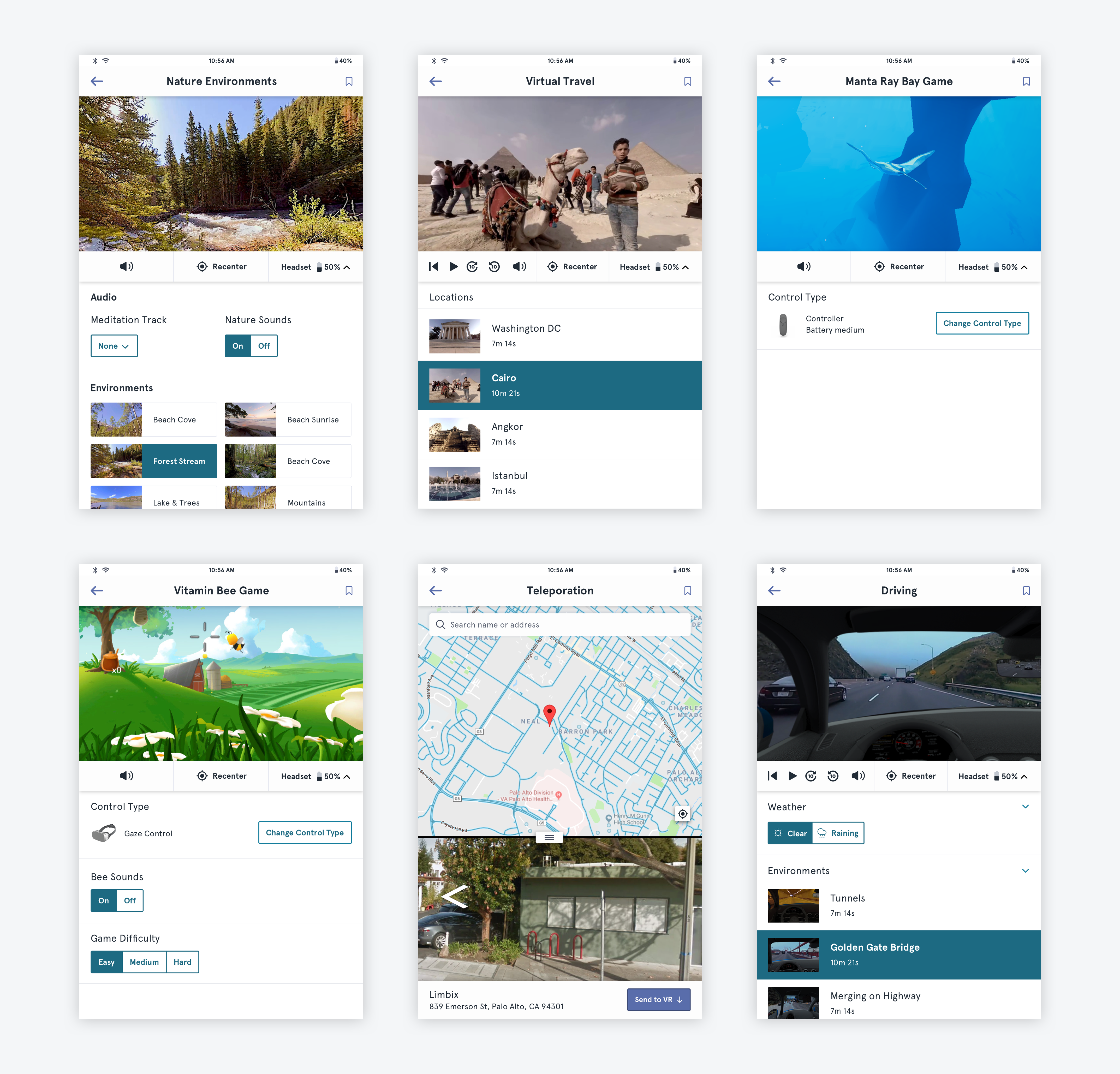
Since we changed the VR controller from a responsive web app to an Android app for a specific tablet, I completely redesigned the interface.
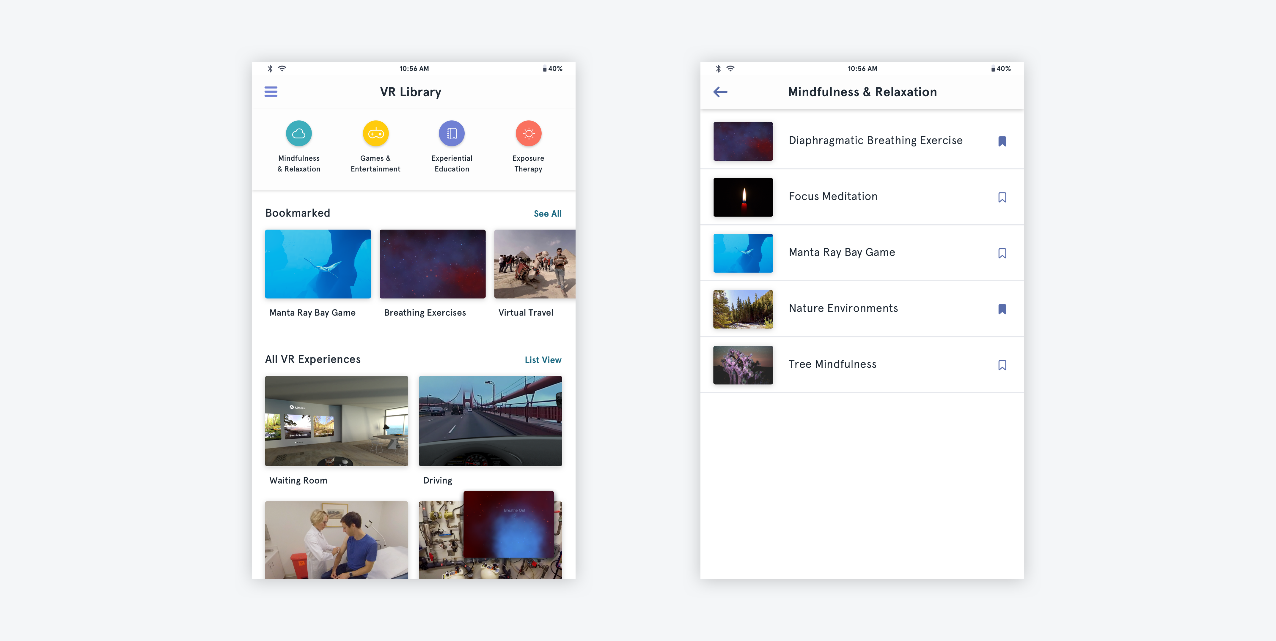
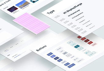
I increased the size of most components to be more easily tappable and redesigned components for a touch-only interface. I also switched from using system fonts to our brand font since speed was no longer an issue.
I added images to the content list page to help reduce the need for therapists to recall the name or icon of the program (the web app used icons for each category).
I designed a feature to save scenes so clinicians can more quickly access their most-used content.
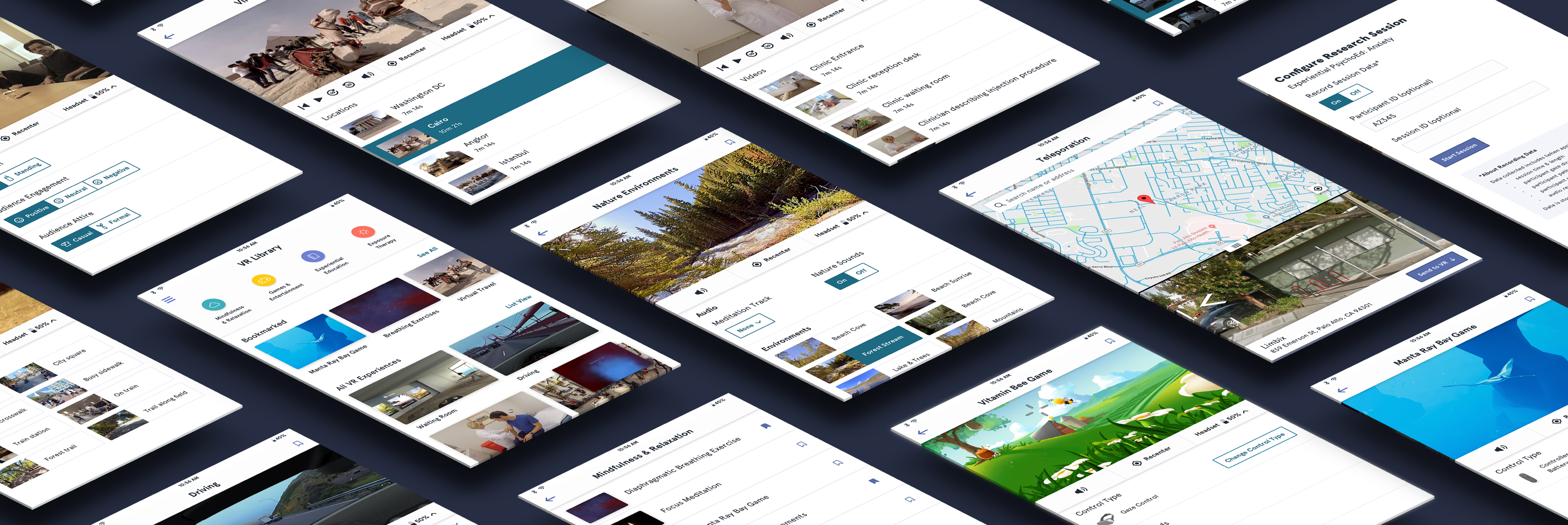
Here are a few pages from the final interface:
