
Limbix Design System
IxD, UI Design
Challenge
I joined Limbix as the first designer about five months before the product launch date. At the time the company only had a logo and a couple months of engineering work that was styled with default bootstrap components.
My task was to come up with branding and a from-scratch design system that was versatile enough to use across web and iOS/Android mobile apps (built using React).
A year later, our startup decided to completely rewrite and redesign our product for an Android tablet app, as well as add a VR interface. This gave me a unique opportunity to completely rebuild our design system (while making sure it stayed consistent with our existing branding).
This case study documents the process of creating and updating a design system at an early stage startup. The process is particularly challenging given the fast-paced nature of startups. As with any software company, at a startup it's essential to organize and consolidate components into a design system in order to build a consistent product as quickly as possible. At the same time, startups have fewer design resources and are more likely to encounter rapid change which can make organizing and documenting design systems difficult.
Part 1: creating a design system from scratch
I only had five months until launch, and the product had a huge scope:
- A responsive web app with separate therapist and patient experiences
- A patient-facing iOS & Android mobile app
- A therapist-facing Android app for managing content and launching Daydream VR.
I also had to design our marketing site and carry out enough UX research to have a solid understand of our users and validate design choices.
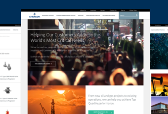
This was the logo and a couple of the initial bootstrap designs that I received as a starting point when I joined Limbix:

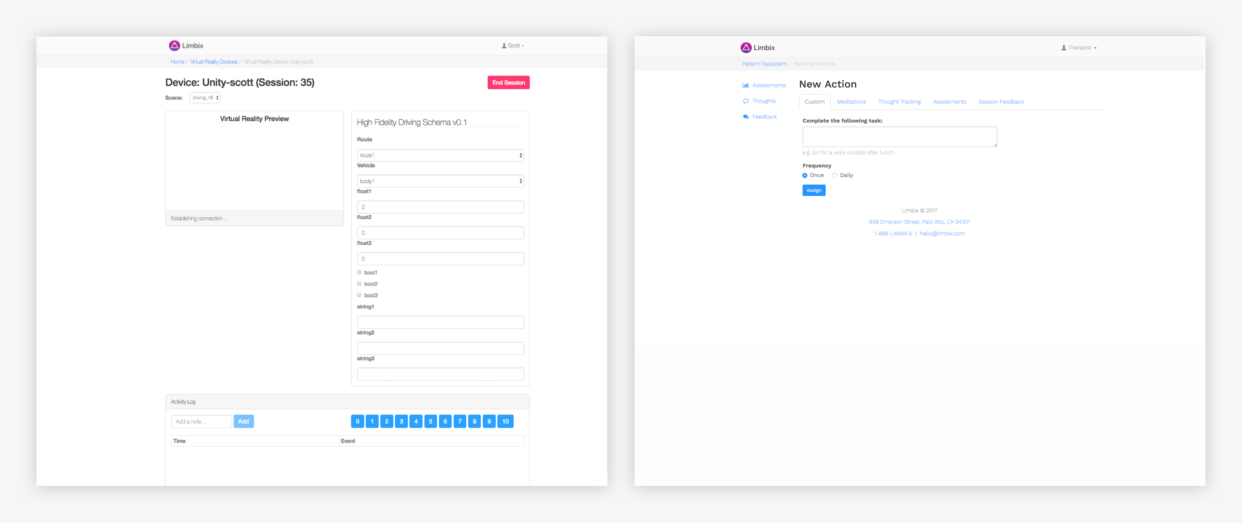

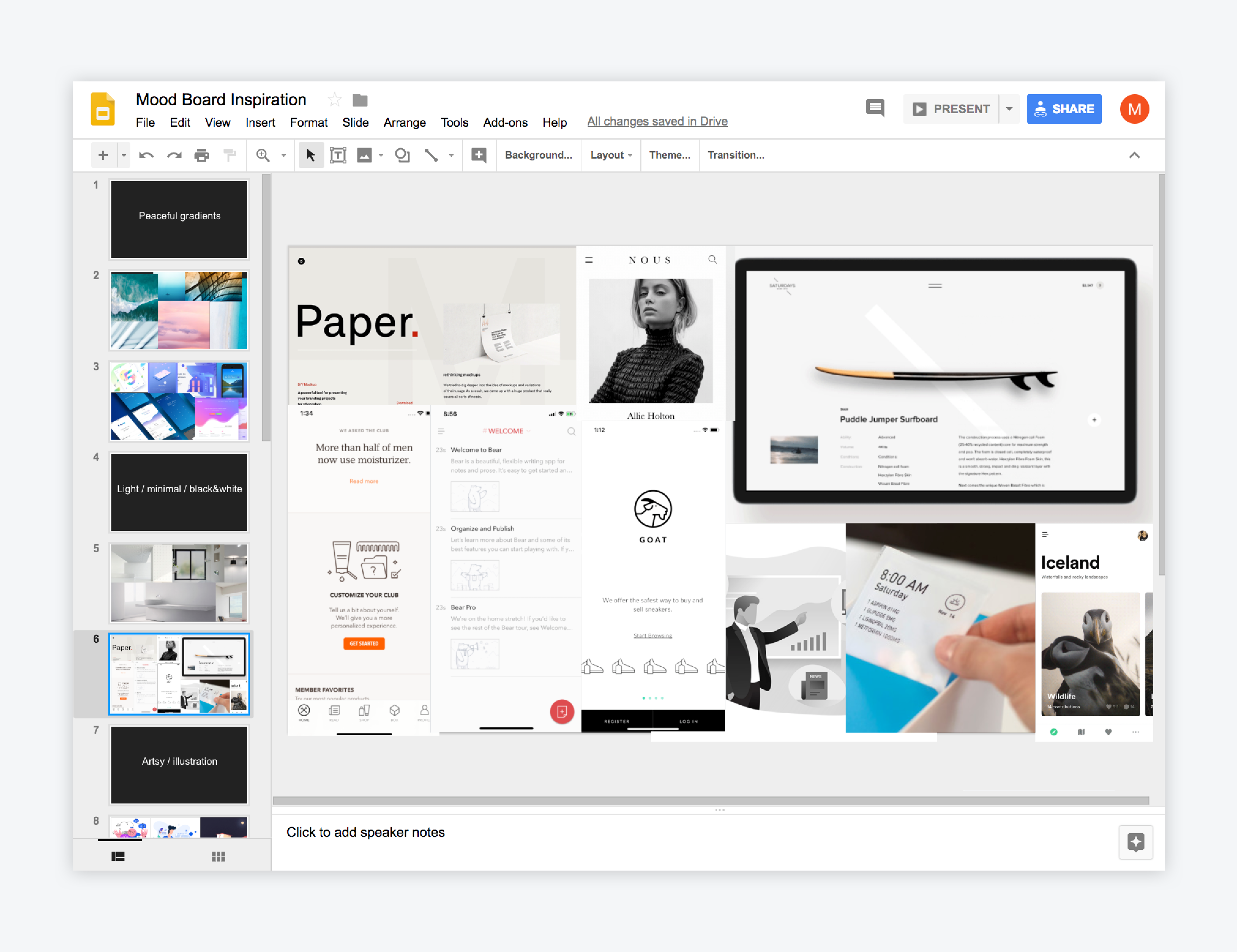
The first thing I did as a new employee was complete individual stakeholder interviews with my team members. This was to see if we were all aligned on the desired look and feel of the brand, as well as the purpose and direction of the product. As a group we agreed on several adjectives and I created a mood board presentation to help visualize our options.

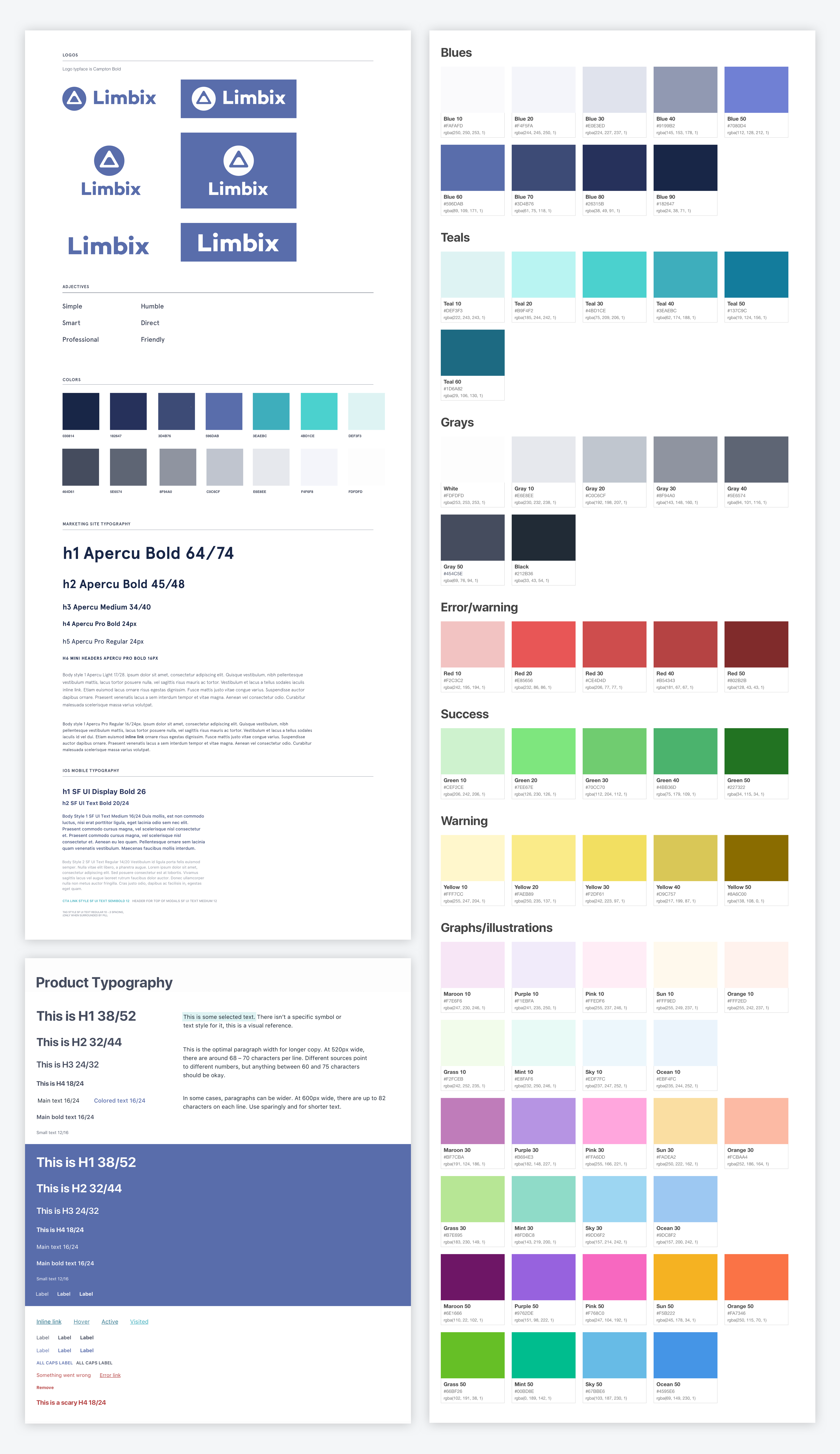
From there I made a base style guide with grids (in a sample sketch artboard), type, and color that I updated and expanded upon throughout the product design process (for example, when I needed an extra color for a hover state).
I opted for system fonts for the product since we were moving fast and working with so many different platforms, but used Apercu as the brand font for the marketing site. I also made small tweaks to our logo to make it bolder and have it match the rest of our branding.
Here is the initial style guide, with separate color and type pages that I created later while working on the product:

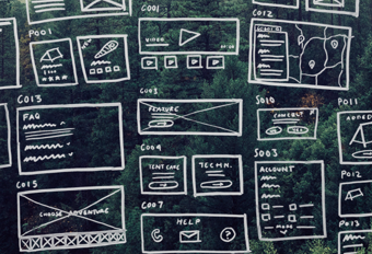
Designing the product from scratch meant that I was constantly creating new components as I designed different pages, then reusing those components whenever possible. One of the benefits of being a design team of one is that I knew both the visual traits and function/behavior of each component, which made it easier to keep the product consistent. With limited time, I went straight from sketching and iterating with teammates to high-fidelity designs.
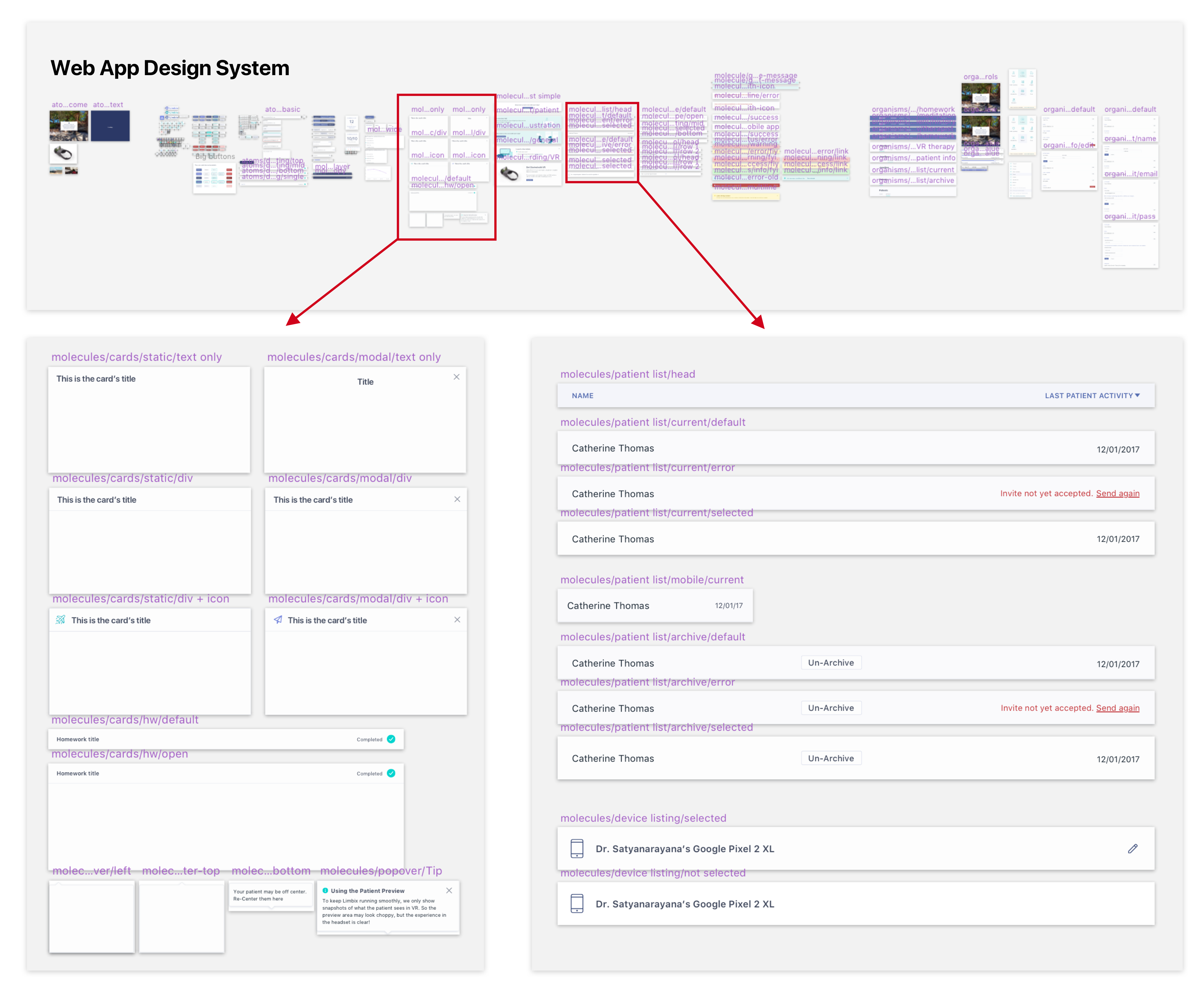
During the two weeks around launch (crunch time!), I hired a remote, part-time freelancer to help me stay on top of organizing and converting components into symbols within Sketch. We used Abstract to allow us to work on the same Sketch files, but this was before Abstract libraries were released, so the design system was simply in the symbols page of the Sketch documents. She used atomic design system naming conventions, and the file was later called “the most organized sketch file I’ve ever seen!” by an employee at a design school where I mentored (Tradecraft).
I kept the mobile and web app files and components separate to keep things simpler (For example -- the Android-only app required Roboto type styles which would have crowded the web app interface). However, this did add some extra work when updating global symbols like icons.
Here is a shot of the web app design system organized with help from a freelancer (from afar, and a couple close-up details). I should note that this was created in created in August 2017 and there have been many features added in Sketch and Abstract since then to help with component organization (keep reading to see updates!):

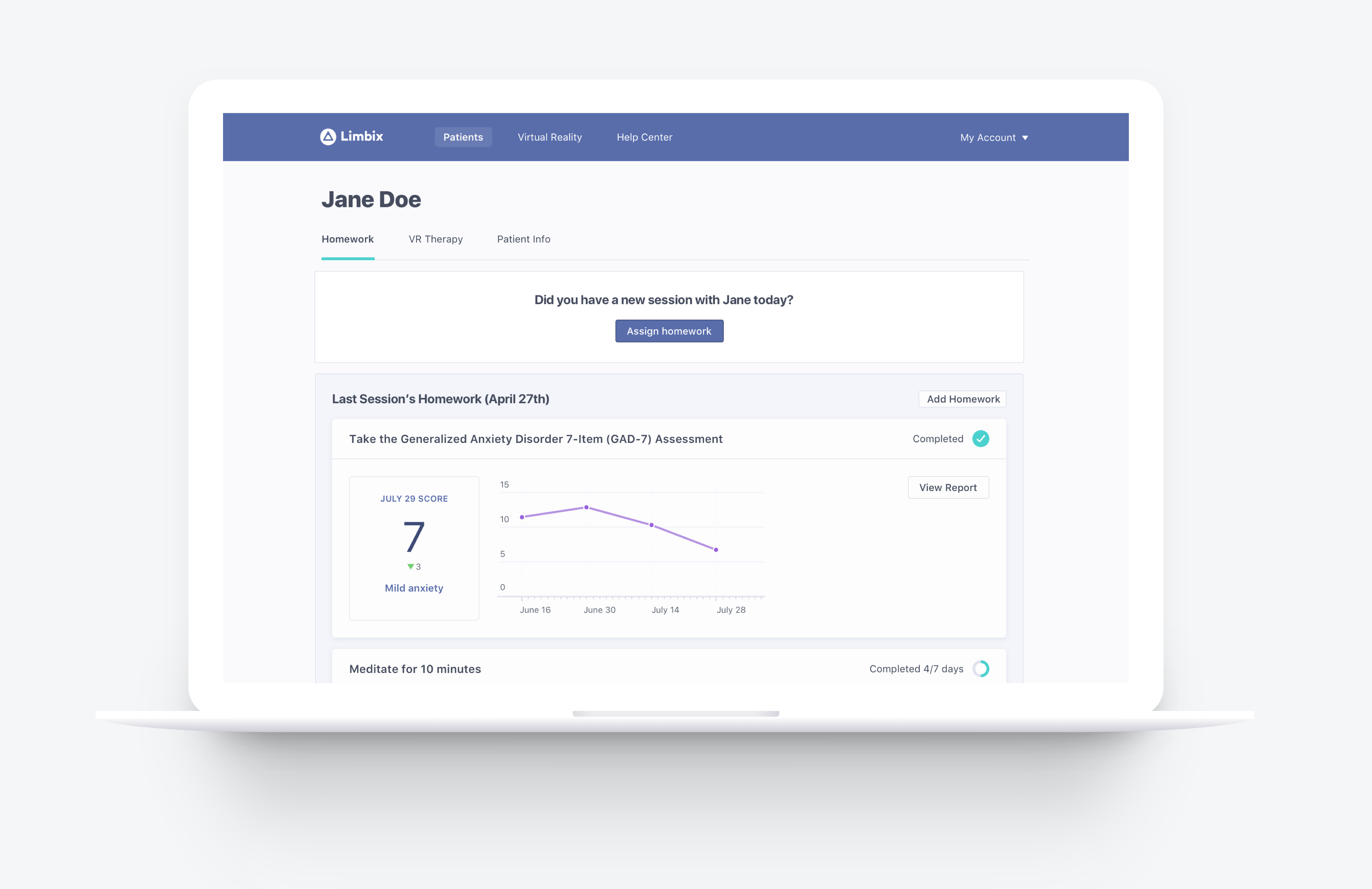
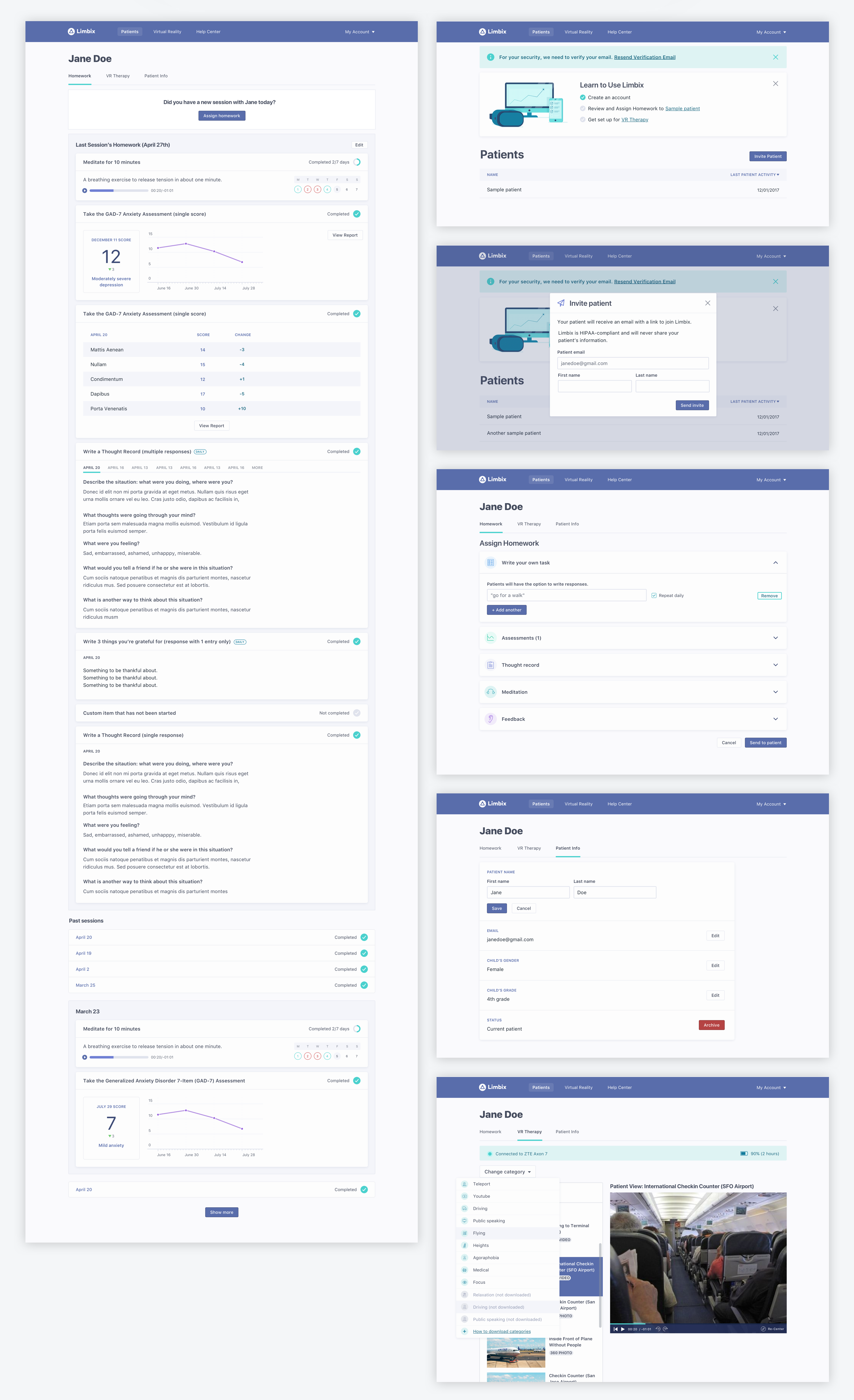
Here are some pages from the web app (therapist and patient view):
Disclaimer: All illustrations are by a freelance illustrator, and the graphs are placeholder (copied and tweaked from a template) since we used a javascript plugin. I designed some of the icons but most were part of a purchased set.


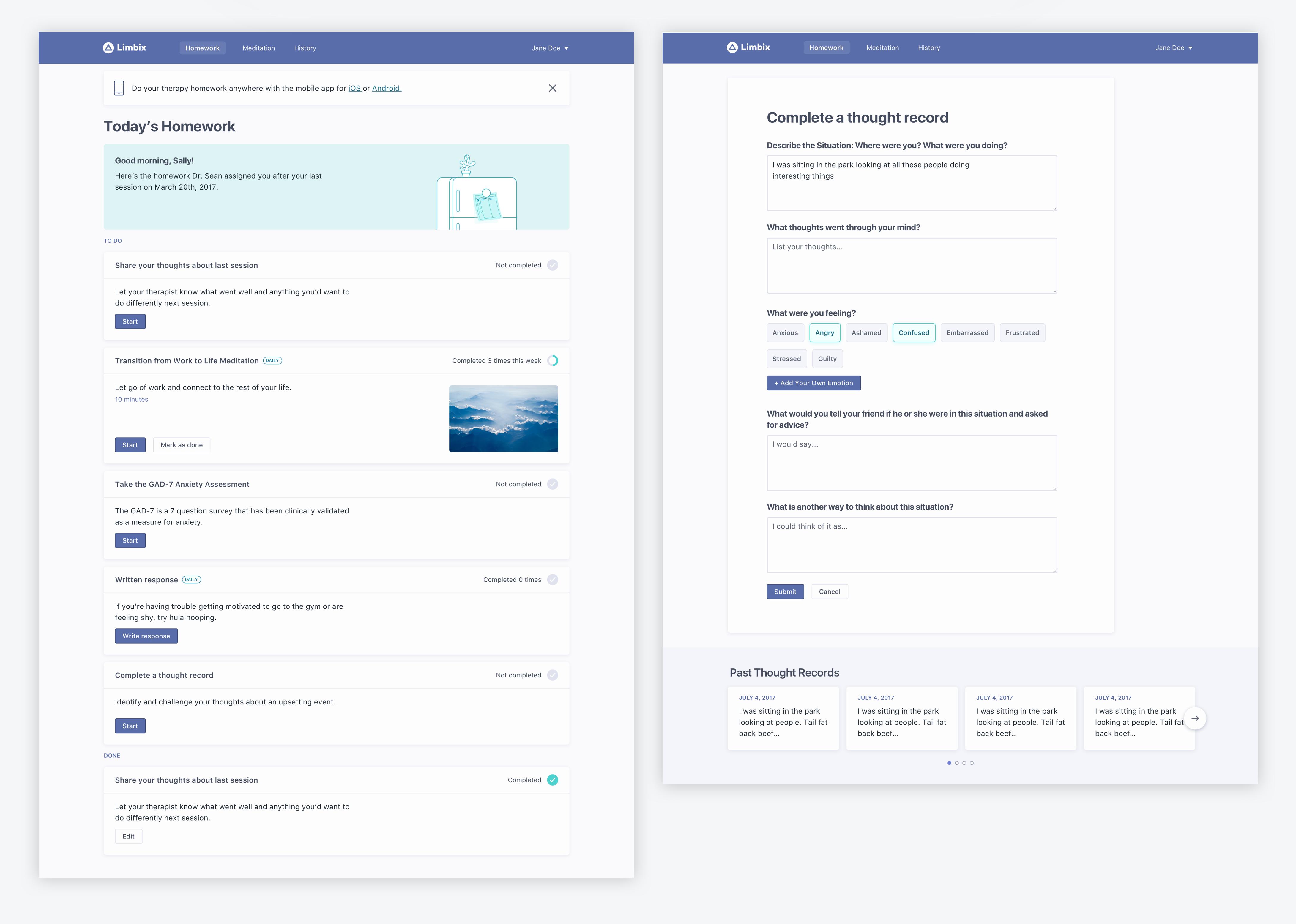

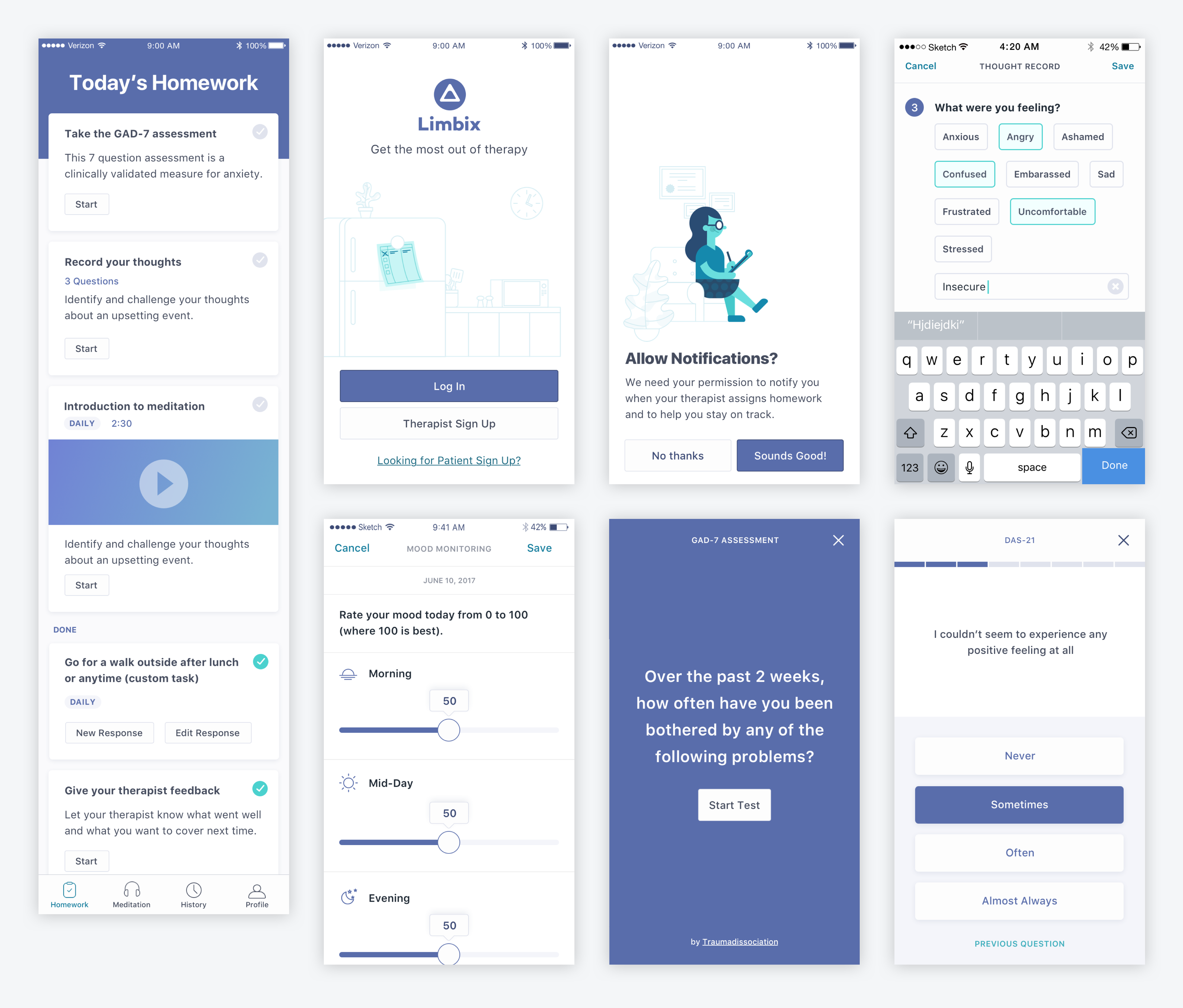
Here are some screens from the patient iOS homework app:

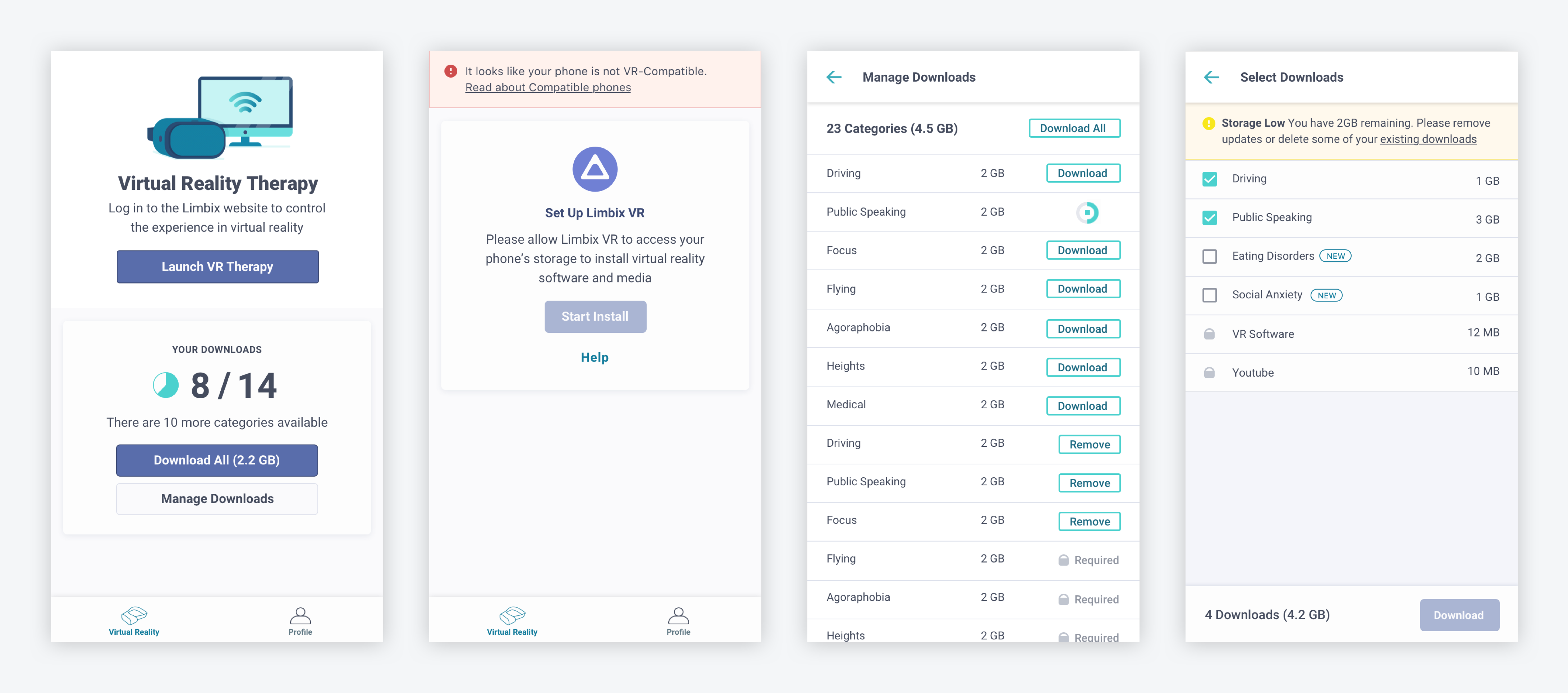
Finally, below is part of the therapist Android app for launching VR and managing content. While this app was the least visually focused, it required the most warning states and friendly copy to prevent errors and make complex, technological requirements understandable.

Part 2: redesigning for an Android tablet app
After a year, we decided to focus solely on the VR side of our product and to rewrite and redesign our product for an Android tablet in kiosk mode. This was a fantastic opportunity to update our design system from the ground up as well as build out a version of the design system to use within VR. While I left the colors the same so the brand would be recognizable and continue to pass accessibility standards, I also made several improvements:
1. More Consistent
I had started our product style guide with system fonts in order to keep web/mobile speeds quick, but switched to our brand font Apercu in order to keep the digital experience more consistent. Moving to a single device also allowed me to simplify components so there is would be less variation for different platforms.
2. Bigger type and buttons
Since all interactions in the new product would be through touch, I made everything larger and more legible. This has a nice, bold feel and has the added benefit of being easier to read and use.
3. Better naming & documentation
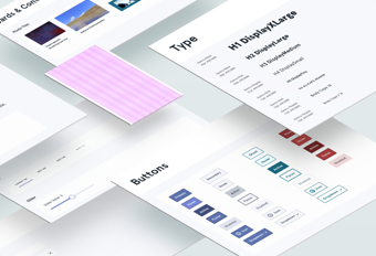
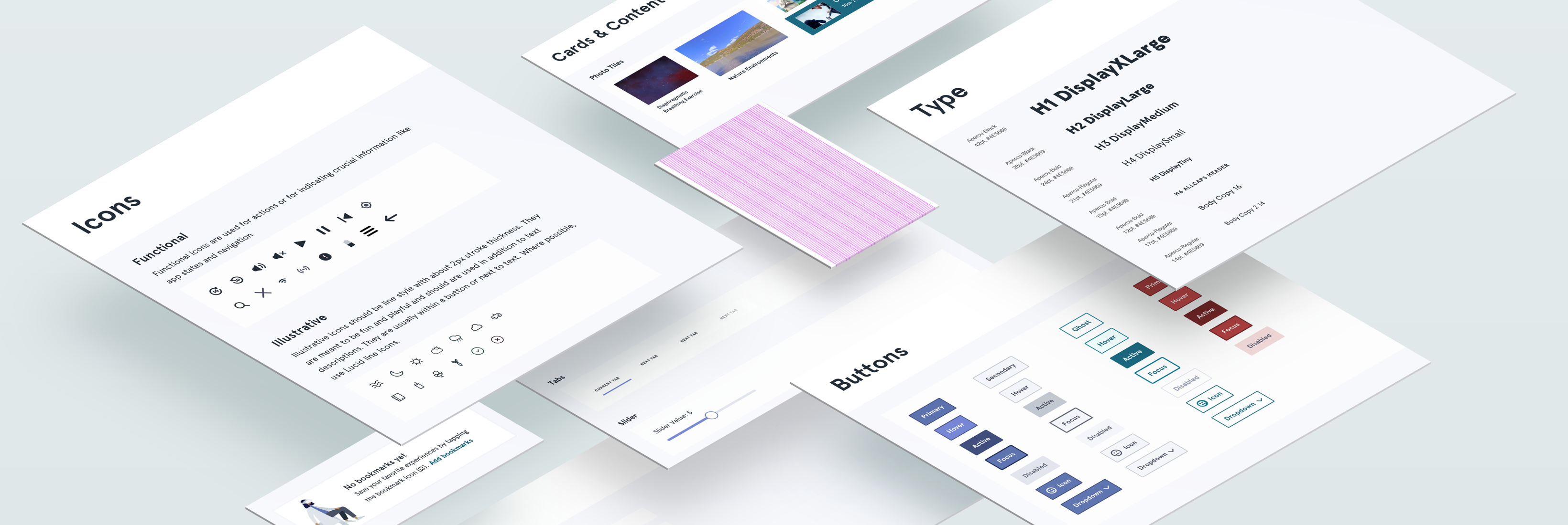
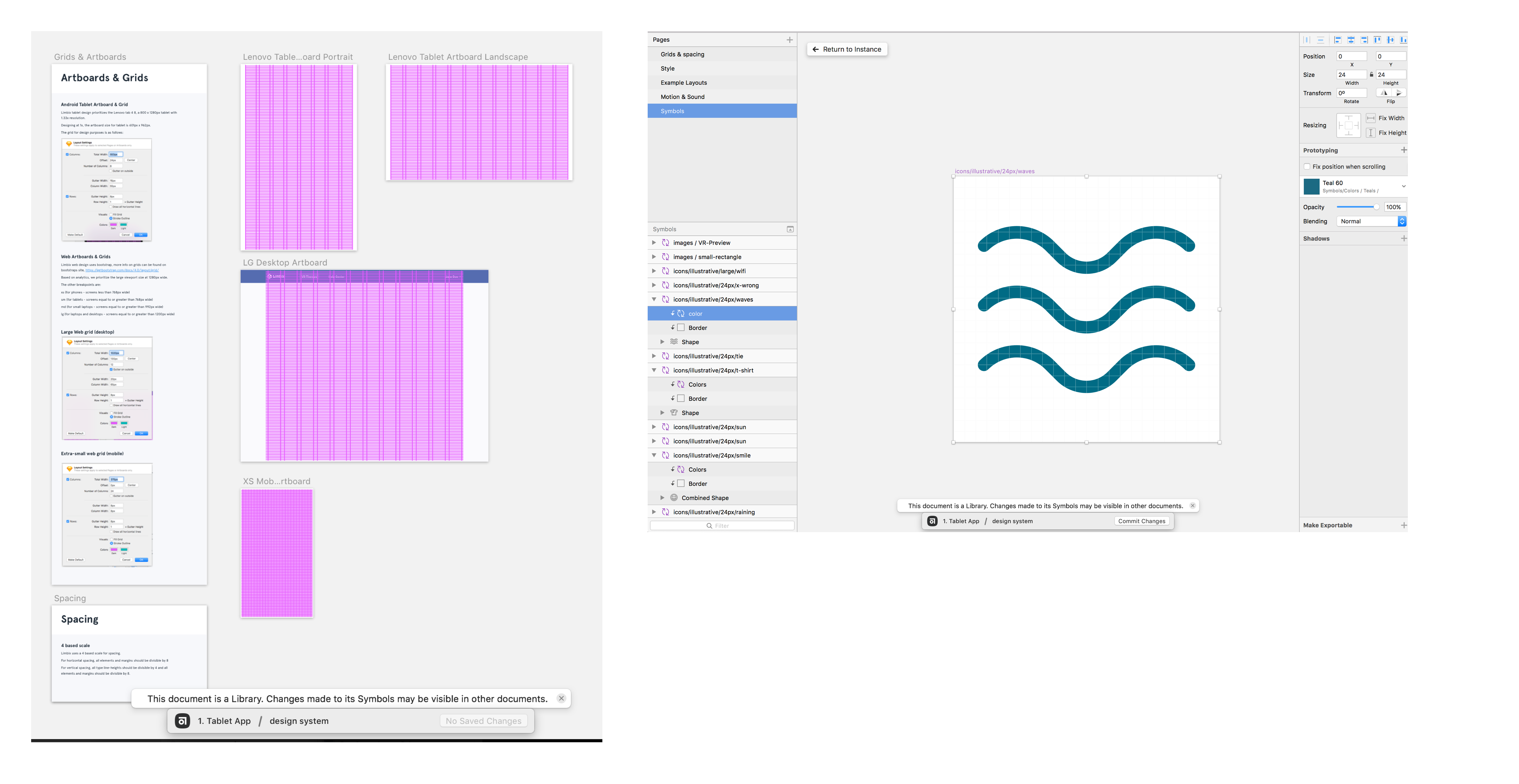
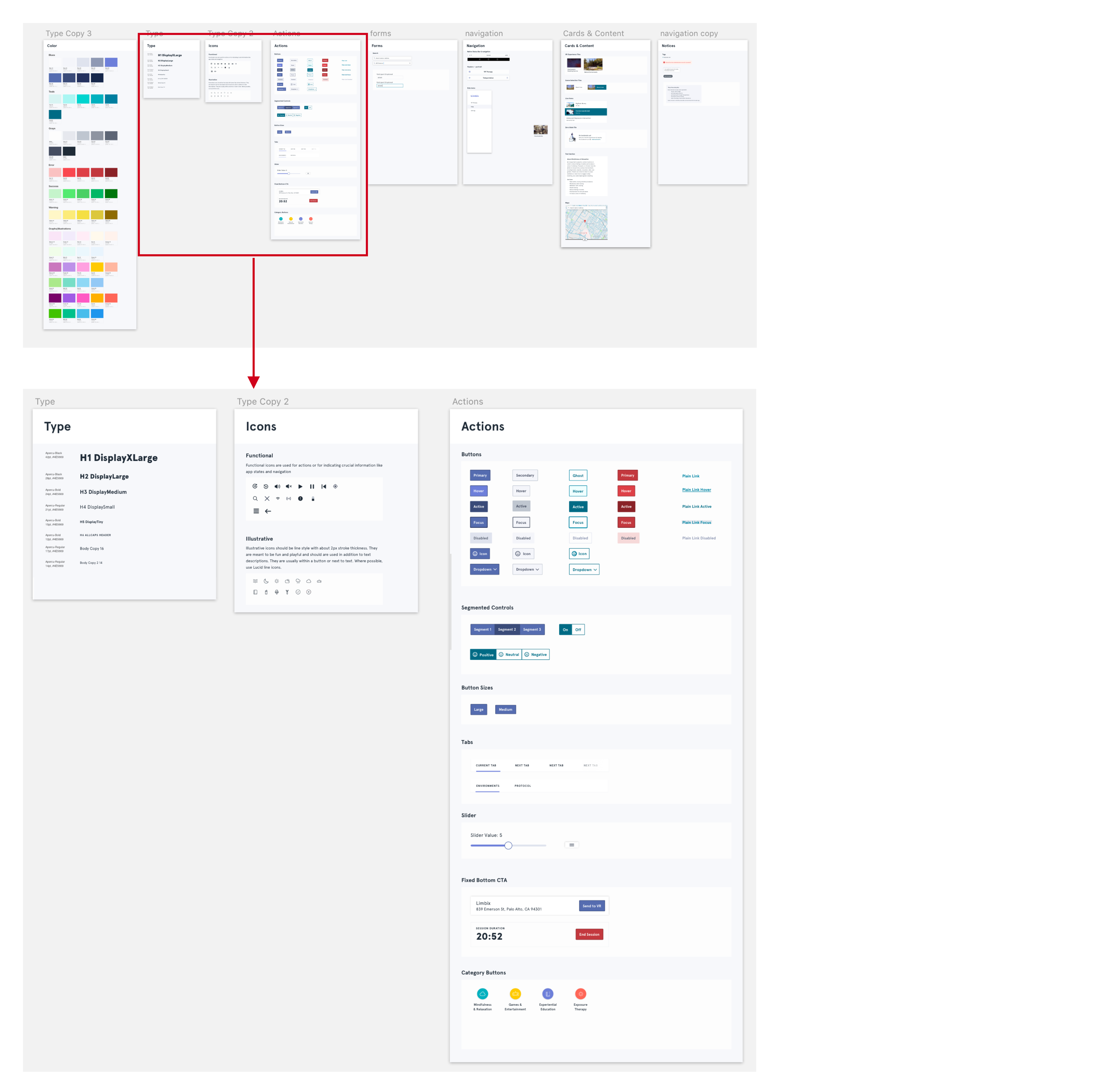
I added better documentation by turning the design system into a separate sketch library with pages showing sample components and explaining how to use them. This makes it easier to collaborate with other designers in the future while also protecting the official design system from accidental changes. I updated naming conventions from atomic-design specific to groupings that better matched my mental model. For example, “buttons” instead of “atoms/buttons”. I also made improvements to nested symbols to help consolidate components (for example, applying color to icons as as symbol mask to make it easier to update).
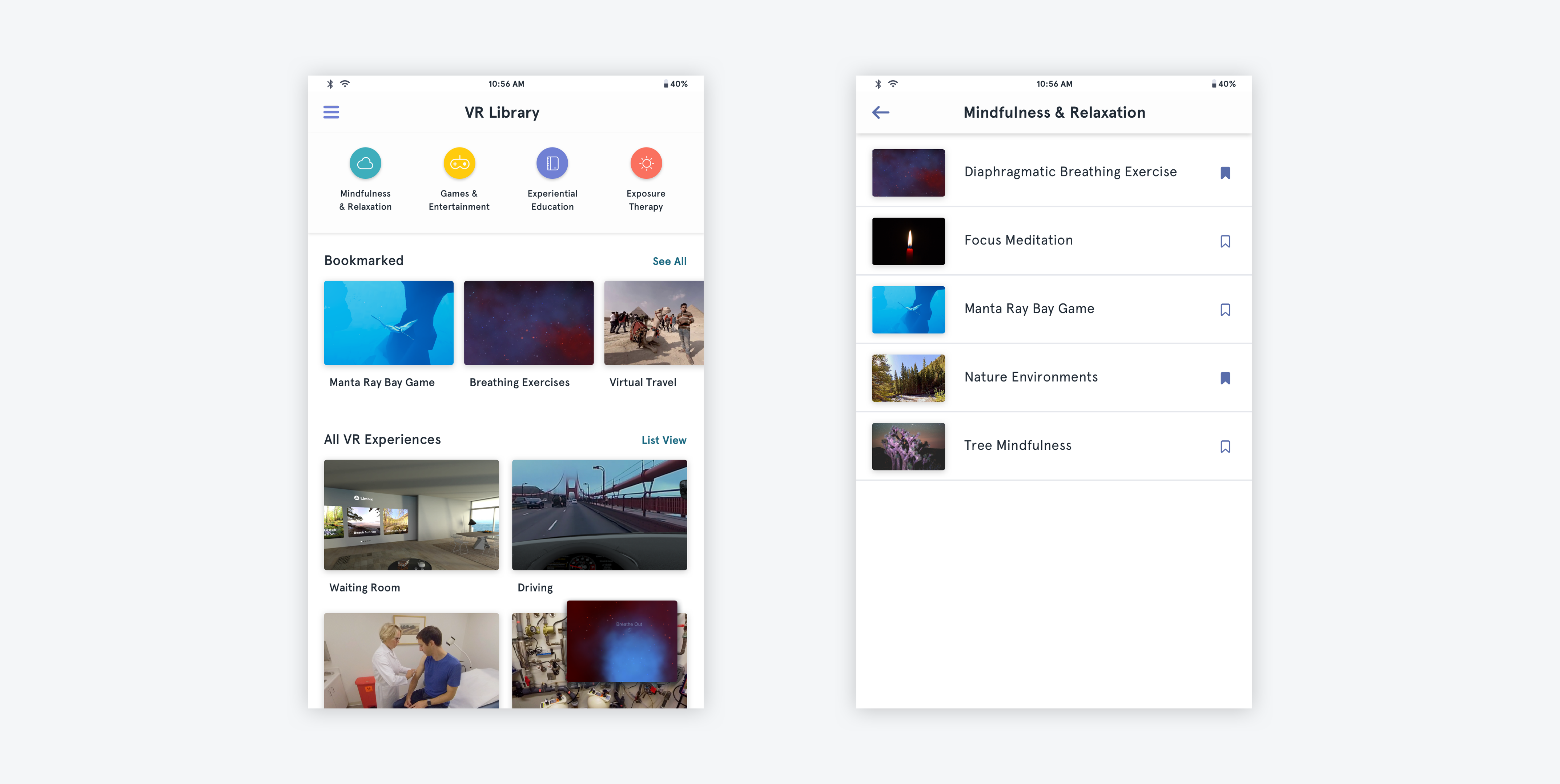
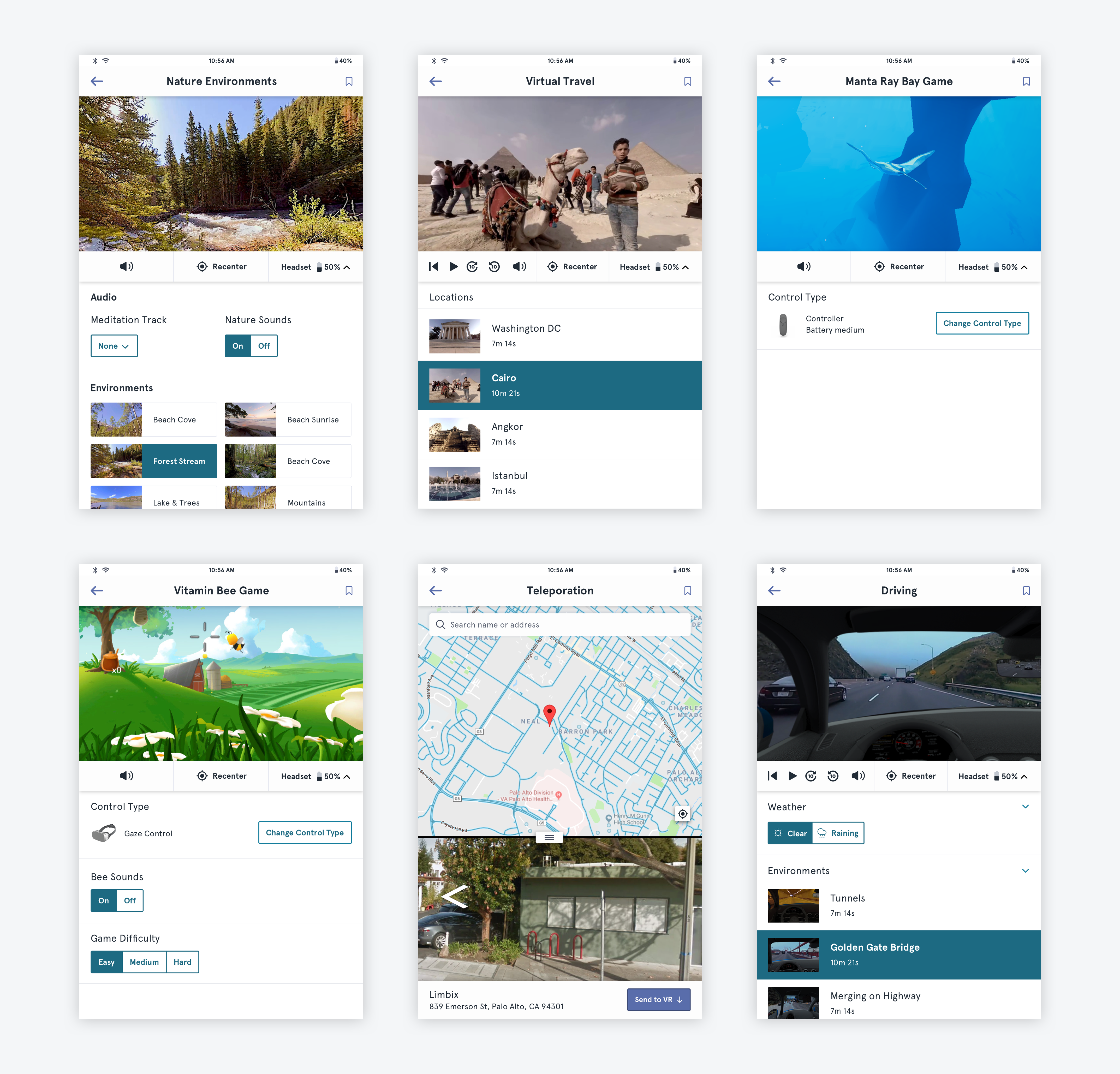
As with all design systems, this one is still in progress and I am still working on organizing and documenting the tablet app designs as well as adding the in-VR interface to the design system. Here are some screens of the current Sketch file:


Below are designs from the new Android app, showing the design system in use. You can read more about the Android app and why we chose to redesign in the Limbix VR Kit case study.
